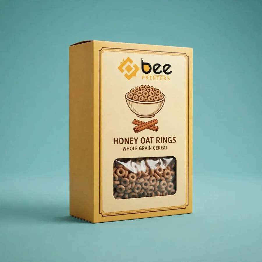
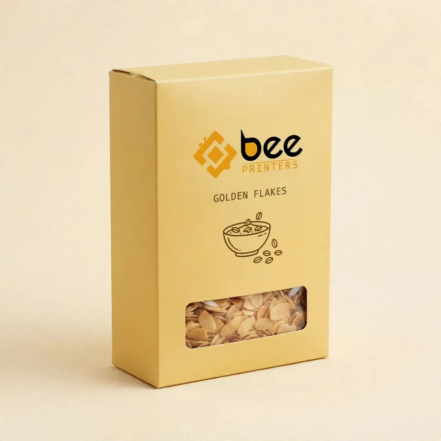
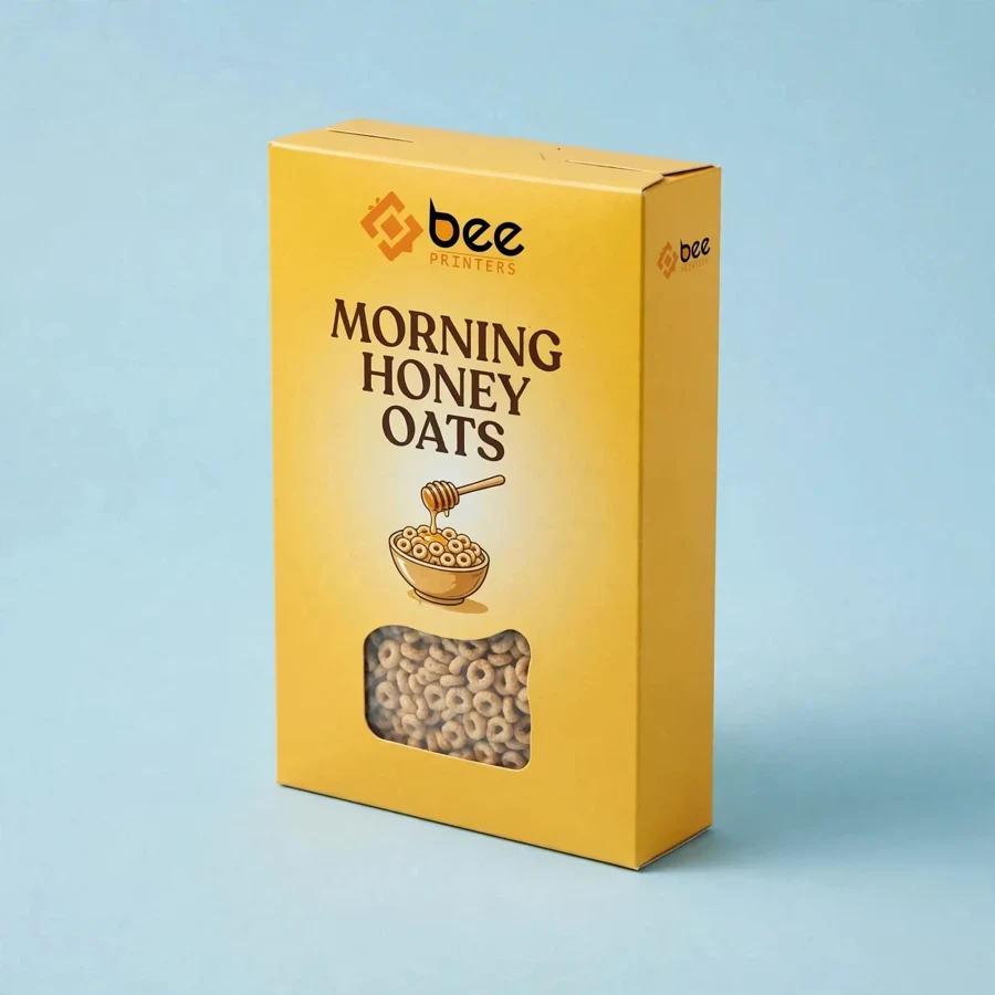
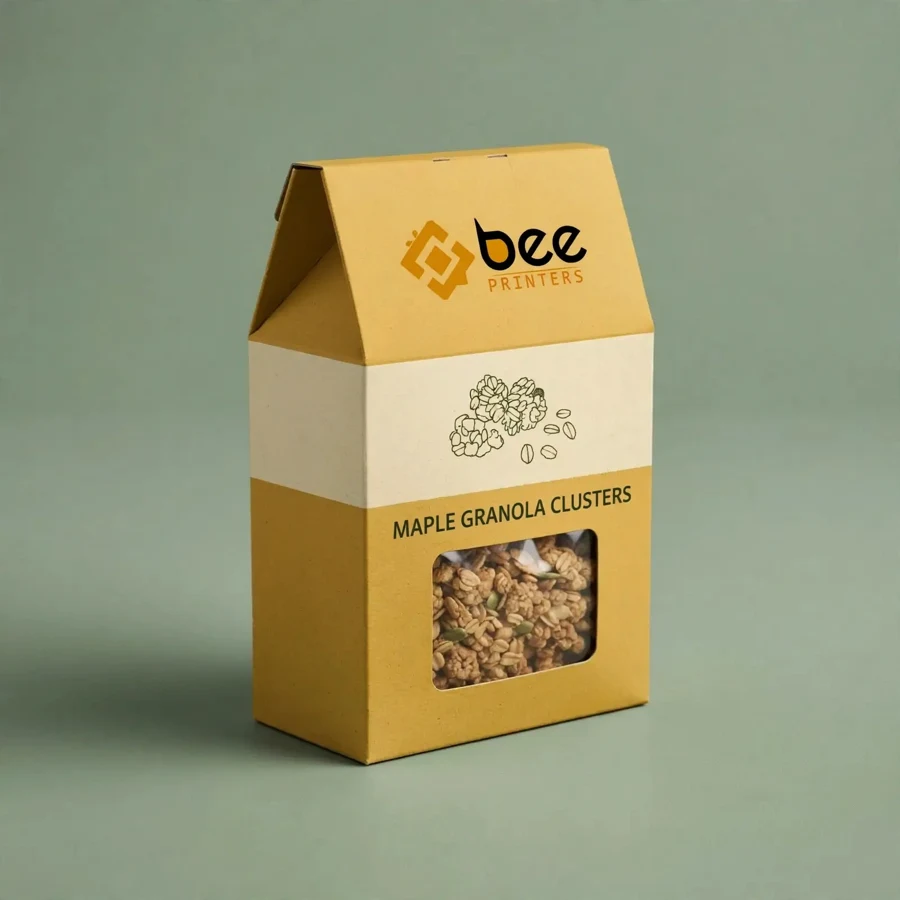
Some colours whisper and some shout, and on a supermarket shelf full of muted browns and quiet pastels, yellow shouts in the friendliest way possible. A custom yellow cereal box catches the eye from the end of the aisle, reads as sunny and cheerful before a single word is read, and tells shoppers that breakfast is going to be a happy part of the day. For a cereal brand, that instant emotional signal is worth more than any claim printed on the panel.
At Bee Printers, yellow cereal boxes are printed in vivid, consistent colour on food-safe paperboard, with your logo and artwork reproduced exactly as designed. Whether yellow is your brand colour, a seasonal accent, or the bold background for a new flavour launch, the print stays bright from the first box off the press to the last one on the shelf. Low minimums, free design support, and free US shipping keep a bold colour choice affordable.
Colour psychology is not abstract theory in the cereal aisle; it is the difference between being seen and being skipped. Yellow is associated with sunshine, warmth, energy, and optimism, which is exactly the mood most people want from breakfast. It is also one of the most visible colours at a distance, which means a yellow box can be spotted while a shopper is still several metres away, long before the brand name is readable.
Yellow works especially well for family cereals, honey and corn flavours, and any product aimed at children. It suggests sweetness without saying a word, and it pairs beautifully with illustrations of fruit, grains, and morning scenes. A brand that owns yellow on the shelf owns a feeling, and feelings are what bring shoppers back week after week.
Yellow is a joyful colour and a demanding one. Printed too pale it looks washed out; printed with the wrong balance it can turn greenish or orange. Getting it right takes careful colour management, clean full-colour printing, and a smooth paperboard surface that holds the ink evenly. That is why yellow boxes are colour-checked through production, so the yellow on the shelf matches the yellow in your brand guidelines.
The artwork around the yellow matters just as much. A strong dark logo, a crisp product name, and clean white or deep-coloured panels for nutrition information keep the box readable and balanced. Our design team can help tune the contrast so the yellow feels sunny rather than loud, and so the text stays legible at arm’s length and across the aisle.
Yellow is generous: it works with reds, blues, greens, and browns, which makes it a flexible background for almost any cereal brand. A honey cereal can pair yellow with warm browns and a honey-dip illustration. A fruit cereal can set yellow against bright reds and greens. A heritage brand can use a soft, buttery yellow with classic typography for a warm, nostalgic feel.
The logo is the anchor. Printed large on the front panel, in a colour that contrasts cleanly with the yellow, it becomes the landmark shoppers look for. Secondary elements such as flavour badges, mascots drawn from your own artwork, and promotional flashes all sit comfortably on a yellow field, because the background does the work of attracting the eye while the details do the work of informing it.
Yellow cereal boxes are built on the same food-safe paperboard as any premium cereal carton, chosen in a thickness matched to the cereal weight and box size. The board gives the tall rectangular box the stiffness to stand upright, stack neatly, and survive handling from warehouse to cupboard. A smooth printable surface is essential for an even yellow, so board quality is checked before printing begins.
Finishing can change how the yellow feels. A gloss lamination makes the colour pop under store lights and gives the box a fresh, energetic shine. A matte lamination softens the yellow into something calm and premium, which suits organic and health-focused cereals. Either finish protects the print from scuffs, so the box stays bright for its whole shelf life.
Yellow works at every size, from family boxes that dominate the shelf to single-serve formats for hotels and travel. Because colour is the hero of this box, larger panels show it off best, but even a compact box in bright yellow stands out in a variety pack or a gift hamper. Dimensions are built around your cereal volume and your retail channel, so the box fits the bag, the shelf, and the shopper’s cupboard.
Brands often use yellow as a range signal: one flavour in yellow, others in different colours, so shoppers can find their favourite at a glance. Seasonal editions can deepen or lighten the yellow for summer or winter promotions without changing the structure, keeping production simple while the shelf stays fresh.
Family cereal brands are the biggest fans of yellow, especially honey, corn, and oat cereals where the colour matches the flavour. Children’s cereals use it for its cheerful energy, and private-label brands use it to stand out against national competitors without spending on elaborate structures. Breakfast brands launching a new flavour often choose yellow for the launch box, because a new colour on a familiar shelf is the fastest way to announce something new.
Gift and hamper companies also favour yellow cereal boxes: a bright box lifts a whole breakfast gift set. For other brightly coloured breakfast packaging, see our cereal boxes, which use the same vivid full-colour printing in formats suited to sweets and treats.
Start with your yellow: a brand colour code, a sample, or a description, and our team will match it through production. Choose the size, the board, and the finish, then supply artwork or use free design support to build the front panel. Low minimums let you test a yellow edition on one flavour, and wholesale pricing rewards a full-range rollout.
Every order ships free within the US. Browse the full range in our custom candy boxes collection to compare formats, then request a quote and put a little sunshine on your shelf.
Yes. Share your colour code or a printed sample and the yellow is matched through production so it stays consistent across the whole run.
Yellow prints best on a smooth white-coated board. On kraft board it takes on a warmer, muted tone, which can suit a natural or rustic brand look.
Low minimums apply, so small and new brands can order a custom yellow edition without committing to a large warehouse run.
| Material | Kraft, Cardboard, Corrugated, Rigid stock |
| Sizes | All custom sizes (any length × width × height) |
| Printing | CMYK / PMS, full-color, offset & digital |
| Finishing | Matte, Gloss, Soft-touch, Foil, Spot UV, Embossing |
| Add-ons | Window cut-outs, inserts, interior printing |
| Minimum Order | 100 boxes |
| Turnaround | 7 to 10 business days after design approval |
| Shipping | Free shipping across the US |