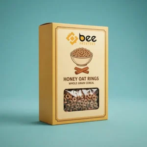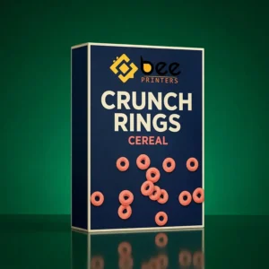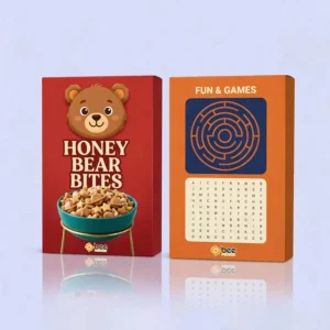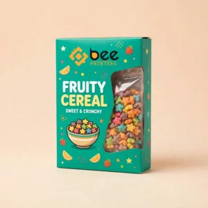
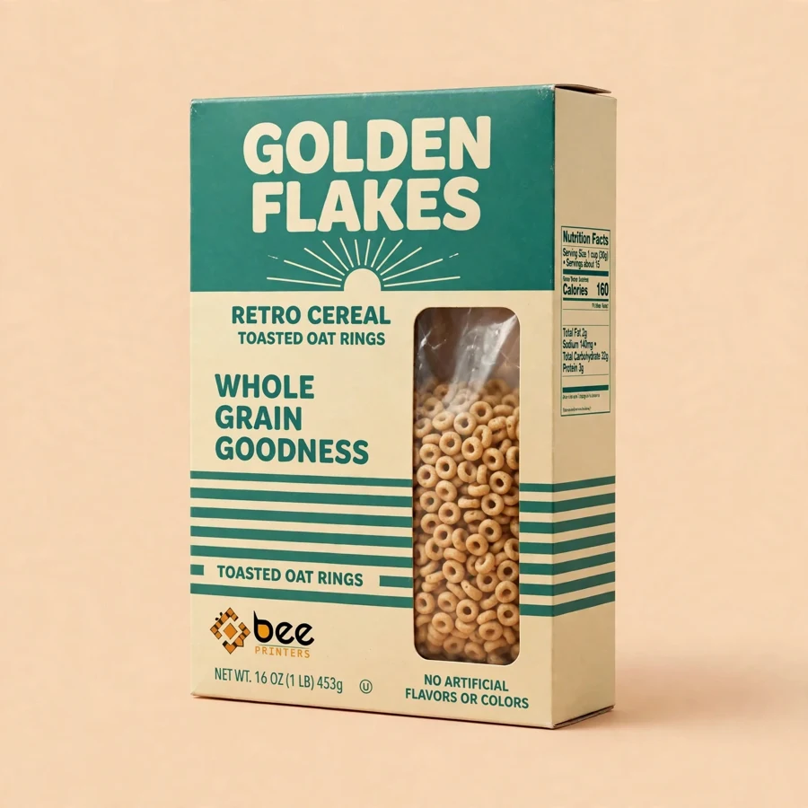
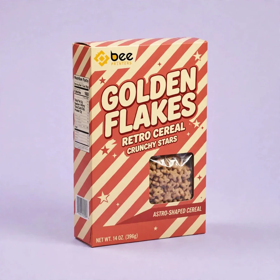
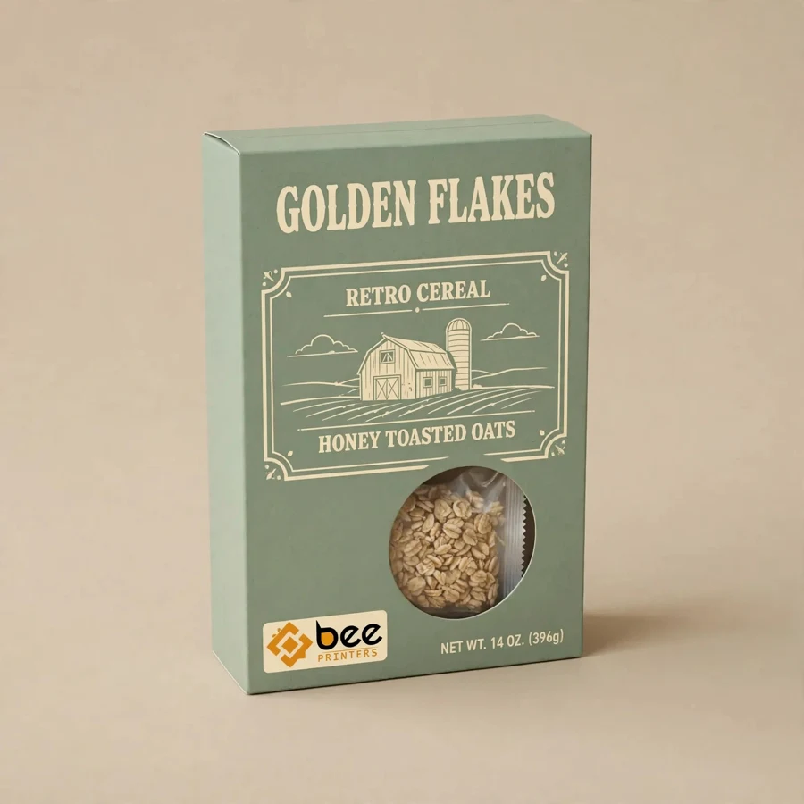
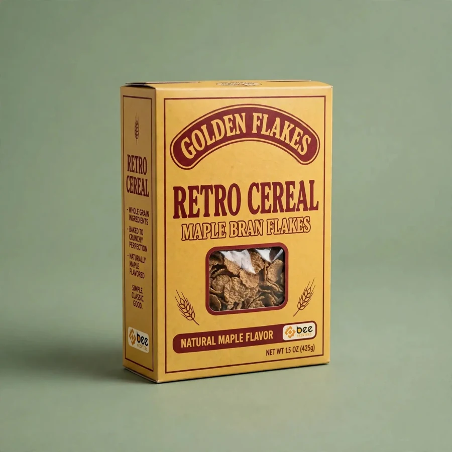
Some packaging chases the future and some packaging remembers the past, and right now the past is winning. Shoppers who grew up with cereal boxes that had hand-drawn illustrations, classic typography, and a warm, honest feel are buying that feeling again, and brands that can bottle it are finding a loyal audience. A vintage cereal box is not old packaging; it is new packaging with a memory, a retro design that feels familiar the moment it is seen.
At Bee Printers, vintage cereal boxes are custom printed with your logo and your own retro artwork on food-safe paperboard, in any size, shape, style, and finish your cereal needs. Durable prints, free design support, and wholesale pricing make a heritage look affordable, whether you are reviving a family recipe or launching a brand-new cereal with an old soul.
Nostalgia is one of the strongest buying motives in food. A shopper who remembers a cereal from childhood does not just buy a flavour; they buy a morning from twenty years ago, a kitchen table, a parent pouring a bowl before school. A vintage box triggers that memory in a single glance, through colours, typefaces, and illustrations that feel like they belong to another decade.
Retro also stands out precisely because so much modern packaging looks the same: bright, glossy, and loud. A muted palette, a serif typeface, and a hand-drawn illustration read as calm and trustworthy by contrast, which suits heritage grains, small-batch cereals, and brands that want to feel crafted rather than manufactured. In an aisle full of shouting, a quiet box gets heard.
Authenticity is the difference between a vintage box and a costume. Real retro design has rules: a limited colour palette of creams, warm reds, deep blues, and soft greens; typography with serifs, hand-lettered curves, or classic block lettering; illustrations that look drawn rather than photographed; and badges, borders, and seals that suggest a product with history. Our design team can help apply those rules to your brand without making the box look like a museum piece.
The details matter most. A small “est.” date, a heritage seal, a line about the recipe’s origins, or a classic serving suggestion all add to the feeling that this cereal has a story. The nutrition panel and ingredients stay modern and legible, because a vintage look must never hide the information today’s shoppers expect. The trick is a box that feels old and reads new.
Vintage cereal boxes have a life beyond the breakfast table. They make excellent gifts, especially in hampers and heritage food collections, where the box itself is part of the present. Limited editions with numbered runs, seasonal retro designs, and anniversary editions turn a cereal box into a collectible, and collectors buy every edition.
Farm shops, heritage museums, and artisan food stores are natural stockists for vintage cereal packaging, because their customers are already shopping for products with a story. A cereal brand with a genuine heritage, or a new brand with a well-told story, can use a vintage box to earn shelf space in stores where a modern-looking carton would never be stocked.
The board behind a vintage box should feel as honest as the design looks. Uncoated or lightly coated paperboard gives a warm, tactile surface that suits retro artwork, while kraft board adds a rustic, natural character that pairs beautifully with heritage grains and wholefood cereals. A smooth white-coated board is the alternative for brands that want vintage colours with a cleaner, brighter reproduction.
Finishing should be restrained. A matte lamination gives the box a soft, paper-like feel that suits the retro look and keeps glare off the artwork under store lights. Spot finishes, used sparingly on a logo or a seal, can add a premium touch without breaking the vintage spell. The goal is a box that feels like it was made with care, because that is what the design promises.
Family-size boxes suit heritage cereals sold in supermarkets and farm shops, where the large front panel gives the retro artwork room to breathe. Mid-size boxes suit smaller households and gift sets, while mini formats work for sampling, hotel trays, and heritage hampers. Because every order is custom, dimensions are built around the cereal volume and the retail channel.
Range thinking works well for vintage brands. A family of cereals can share one retro design system, with each flavour distinguished by its own accent colour and illustration, so the range reads as a heritage collection on the shelf. For premium rigid formats in a heritage style, see our cereal boxes, which bring the same crafted feel to bakery ranges.
Heritage cereal brands with a real history are the natural buyers, from family mills to regional oat and grain companies. New artisan cereal brands use vintage design to signal craft, small batches, and honest ingredients without saying a word. Private-label brands use retro packaging to stand out in premium and organic ranges, where a vintage look suggests quality and tradition.
Gift companies, farm shops, and museum stores order vintage cereal boxes for hampers and heritage collections, where the packaging is part of the product. Subscription breakfast services use them to add variety and charm to a monthly delivery, because a retro box feels like a discovery rather than a delivery.
Ordering starts with your story: the recipe, the heritage, the illustrations, and the typefaces that make your brand feel like it has history. Share your artwork, or use free design support to develop a retro look from your logo and your flavour story. Choose the size, the board, and the finish, then confirm the quantity. Low minimums let you test a vintage edition on a single flavour.
Wholesale pricing rewards larger runs, and every order ships free within the US. Browse the full range in our custom rigid bakery boxes collection, then request a quote and give your cereal a box with a past worth remembering.
Yes. A vintage look is a design style, not a claim about age. New brands use retro artwork to signal craft and quality, while the box carries only honest information about the product.
Uncoated paperboard or kraft board gives the warmest retro feel. A smooth white-coated board is the better choice for brighter vintage colours.
Yes. Low minimums let you launch a vintage edition on a single flavour or a limited run without committing to a large warehouse order.
| Material | Kraft, Cardboard, Corrugated, Rigid stock |
| Sizes | All custom sizes (any length × width × height) |
| Printing | CMYK / PMS, full-color, offset & digital |
| Finishing | Matte, Gloss, Soft-touch, Foil, Spot UV, Embossing |
| Add-ons | Window cut-outs, inserts, interior printing |
| Minimum Order | 100 boxes |
| Turnaround | 7 to 10 business days after design approval |
| Shipping | Free shipping across the US |