Color is the first thing a shopper sees on a breakfast shelf. Before the brand name is read or the flavor is considered, the color of the box catches the eye, and blue is one of the most trusted colors in food packaging. A blue cereal box feels fresh, clean, and calm, which is why so many breakfast brands choose it. Bee Printers offers custom blue cereal boxes with bright printing and eco-friendly materials, giving cereal brands a box that stands out on the shelf and keeps the cereal fresh inside.
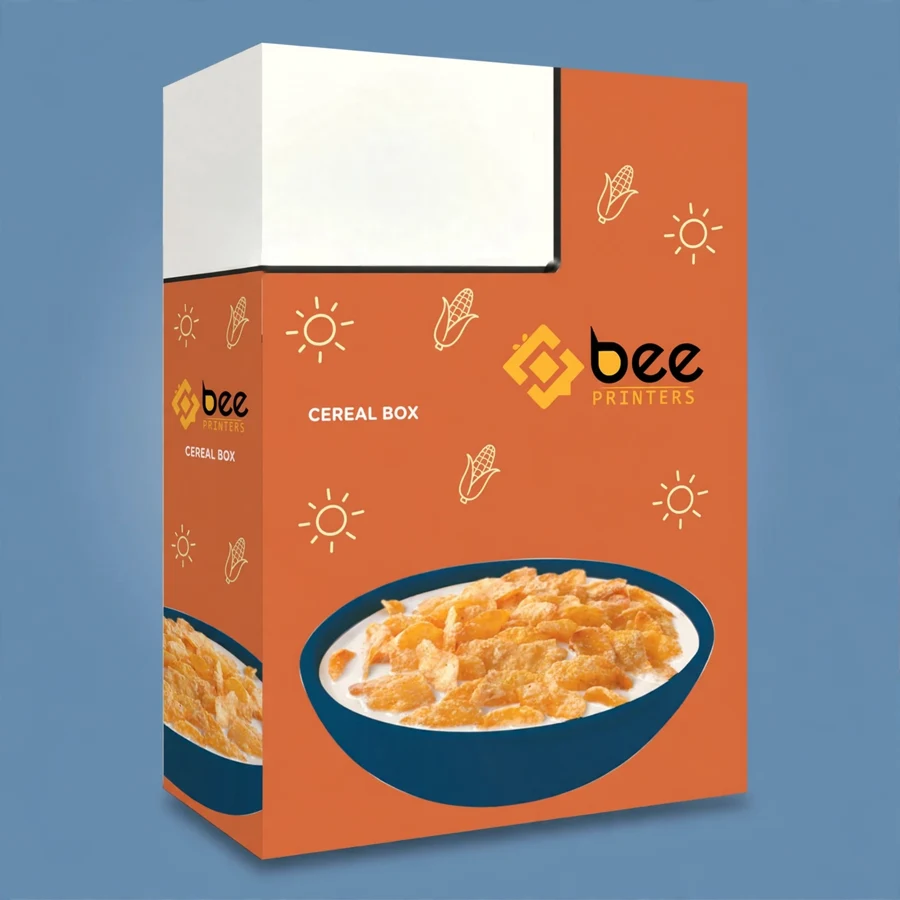
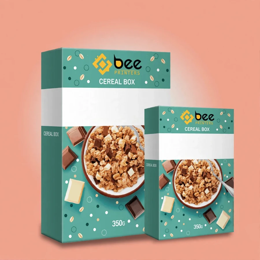
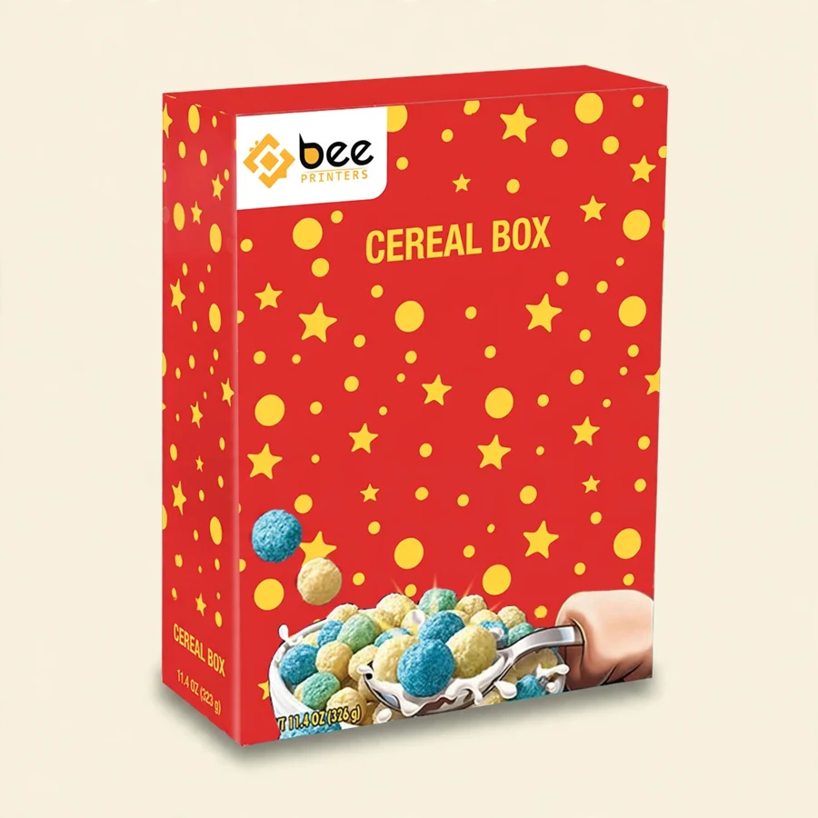
The box is the familiar tall cereal box shape, with a flat front panel for the brand and a top that opens and closes for pouring. That shape is familiar because it works: it stacks well, it stands upright, and it is easy to pour from. The blue color is printed across the box, so the whole package carries the brand’s look rather than just a logo on a plain background. A box that is blue all over is easy to spot in a crowded aisle, and easy to remember when the customer comes back for more.
Keeping cereal fresh is the box’s practical job. The box protects the inner bag from light, dust, and knocks, and its closing top helps keep the cereal crisp between servings. A box that closes properly makes a real difference to the eating experience, because cereal that goes stale is cereal that gets thrown away. The cardboard is sturdy enough to hold its shape through the life of the box, from the store shelf to the last bowl.
Blue is associated with freshness and trust, and those are useful qualities for a breakfast product. Shoppers link blue with morning, with water, and with clean flavors, which suits cereal well. A blue box also stands apart from the reds, yellows, and oranges that dominate many breakfast shelves, so it catches the eye precisely because it is different. In a row of warm colors, a cool blue box is the one a shopper’s eye lands on.
The shade of blue matters. A deep navy feels premium and serious, and suits a brand that wants to look established and trustworthy. A bright sky blue feels fresh and energetic, and suits a brand aimed at families or at younger customers. A soft pastel blue feels gentle and suits a brand with a calm, natural image. The blue can be chosen to match the brand’s personality, and the rest of the design can be built around it.
Blue also works well with the other colors a cereal brand needs. White text reads clearly on blue, which makes the brand name and the product name easy to see. Images of cereal, fruit, and milk look vivid against a blue background, because the contrast is strong without being harsh. A designer working with a blue box has a good base to build on, and the finished box looks polished without much effort.
The box is printed in full color, so the blue can be exactly the shade the brand wants, and the rest of the design can be printed around it. A logo, a product name, an image of the cereal, and any other elements the brand needs can all be placed on the front, sides, and back. The print is sharp and the colors are consistent across the whole run, so every box looks the same as the one before it.
Bright designs suit a blue box. A bold image of the cereal in a bowl, a splash of milk, or a scattering of fruit can make the box look appetizing from a distance. The design should make the customer want to pick the box up, and a bright, clear image does that better than a dull or cluttered one. The front panel should be kept focused: the brand, the product, and one strong image are enough.
The back and sides of the box carry the details: nutritional information, ingredients, serving suggestions, and any messages the brand wants to share. These panels are read by customers who have already picked the box up, so they should be clear and easy to follow. A well-organized back panel helps the customer trust the product, because it shows the brand has nothing to hide.
The boxes are made with eco-friendly materials. The cardboard is a paper-based material that is widely recycled, and the box can go into the paper recycling stream after use. For brands that care about their environmental image, that matters, because customers increasingly look at packaging and ask what happens to it after the product is finished. A box that is easy to recycle is a box that fits a responsible brand.
Eco-friendly does not mean fragile. The cardboard used for these boxes is strong enough to protect the cereal through shipping and stacking, and it holds its shape on the shelf. The print is done with food-safe inks that are suitable for food packaging. A brand can talk about its packaging honestly, without overstating what the box does, and the box itself supports that message.
The boxes arrive flat, which reduces shipping volume and makes storage easy. Flat-packed boxes take up far less space than formed boxes, so a large order can be stored in a small area and formed as needed. That is practical for a brand that packs its own product, and it also means fewer delivery trips, which is a small but real benefit.
Cereal brands are the obvious users, from large manufacturers to small startups. A startup with a new cereal can use a blue box to establish its look from the first day, and the color gives the brand a clear identity that customers can recognize. A larger brand can use blue for a specific product line, so customers can tell it apart from the brand’s other products at a glance.
Private-label and store brands use blue cereal boxes too. A supermarket that sells its own cereal can choose blue for its packaging and build recognition across its whole own-brand range. The color becomes a signal: customers learn that the blue box is the store’s cereal, and they look for it without reading the label in detail.
Gift and subscription boxes are another use. A breakfast gift set or a monthly subscription box can include a blue cereal box as the main item, with the color setting the tone for the whole package. The box looks good on its own and photographs well, which matters for brands that sell online and rely on product photos to make the sale.
Blue cereal boxes sit within a wider range of food packaging, and they share the same standards as the rest of the range. The Custom Food Boxes category brings together boxes for cereal, snacks, bakery goods, and takeaway food, all made to the same practical standard: food-safe materials, clear printing, and a structure that protects the product. A brand that sells more than one food product can source its boxes from one place and keep the quality consistent.
For brands that want a different format for the same product, the range offers alternatives. Our Cereal Mylar Bags are a flexible option for cereal sold in bags rather than boxes, and they can carry the same branding so the product looks consistent across formats. A brand can offer its cereal in a box for the shelf and in a bag for a different channel, with the same colors and the same logo on both.
Wholesale pricing makes the blue cereal box practical at scale. Ordering in bulk keeps the unit cost low, and the boxes can be stored flat until they are needed. A brand that orders a large run does not need to think about boxes again for a long time, and the consistent print quality means every box looks as good as the first.
Start with the blue and build the design around it. Choose a shade that suits the brand, then pick one or two accent colors that work with it. White is almost always a good accent for text, because it reads clearly on any shade of blue. A warm accent, such as orange or yellow, can add energy to the design and make the food image stand out. Too many colors will make the box look busy, so keep the palette tight.
Keep the front panel simple. The brand name, the product name, and one strong image are enough. The customer should be able to understand what the product is in two seconds, from a normal shopping distance. Small details, such as a badge or a short claim, can sit on the front too, but they should not compete with the main message. If the front panel is crowded, the customer will move on to the next box.
Check the design on a real box before ordering a large run. Colors look different on a screen than they do on cardboard, and a blue that looks perfect digitally may look too dark or too bright in print. A sample box shows the true color and the true sharpness of the print, and it is worth the small delay to get it right. A blue cereal box that is printed well is a box that sells itself from the shelf, and that is the whole point of the packaging.
| Material | Kraft, Cardboard, Corrugated, Rigid stock |
| Sizes | All custom sizes (any length × width × height) |
| Printing | CMYK / PMS, full-color, offset & digital |
| Finishing | Matte, Gloss, Soft-touch, Foil, Spot UV, Embossing |
| Add-ons | Window cut-outs, inserts, interior printing |
| Minimum Order | 100 boxes |
| Turnaround | 7 to 10 business days after design approval |
| Shipping | Free shipping across the US |