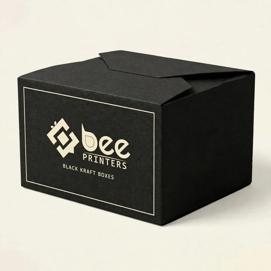
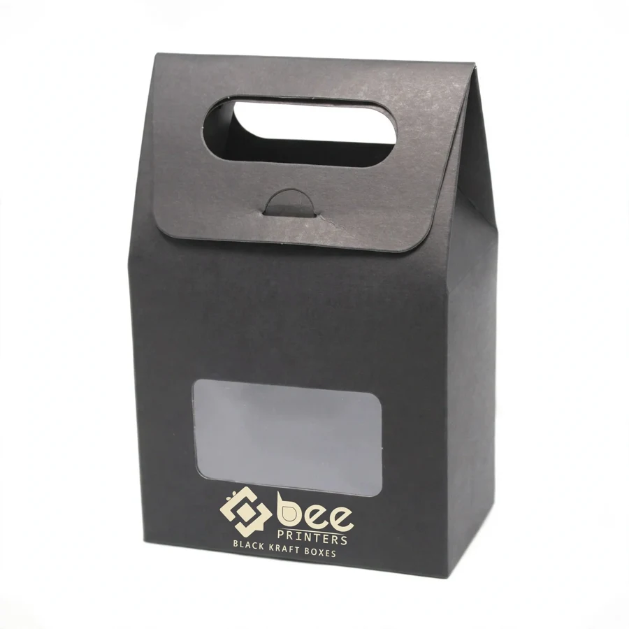
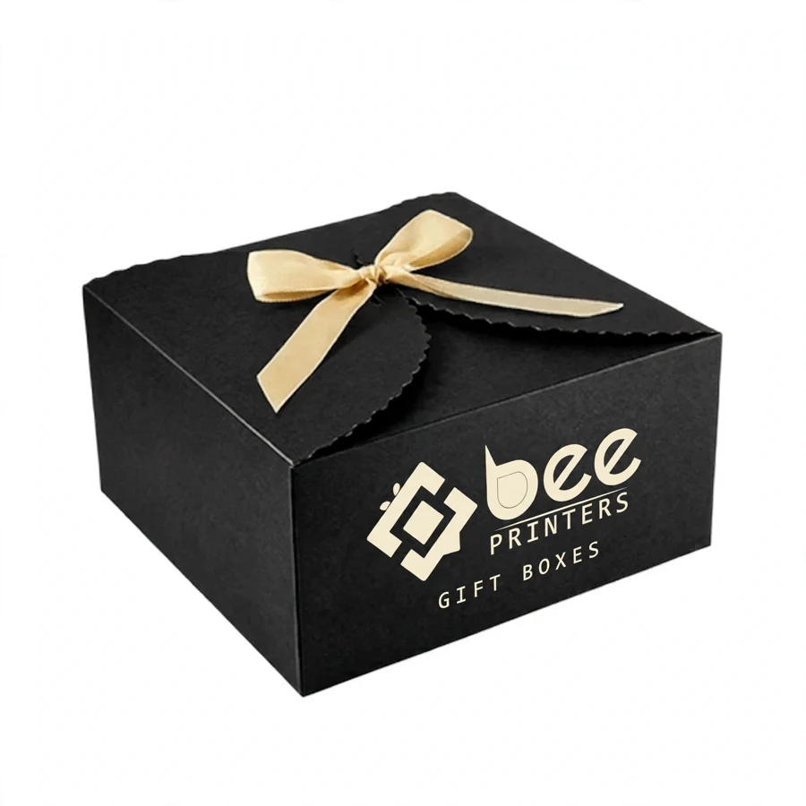
Black kraft board has a character that plain brown kraft does not: a deep, rich black surface with the same natural fiber texture underneath. It looks modern and confident, and it makes printed artwork stand out in a way that lighter boards cannot match. At Bee Printers, custom black kraft boxes combine that striking look with a sturdy structure and clean printed branding, so the packaging suits retail shelves, gift sets, and online orders alike.
The through-dyed fiber is what makes black kraft different from a black-printed board. The color runs through the material rather than sitting only on the surface, so the edges, the folds, and the inside of the box carry the same deep tone. A fold does not reveal a pale line, and a scuff does not show a light mark underneath. That consistency is the detail that makes a black kraft box look intentional rather than printed black, and it is worth checking on a sample before the full run.
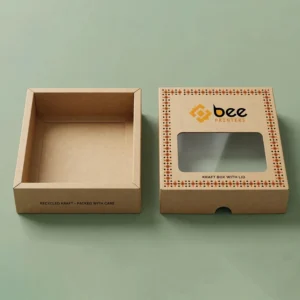
The structure follows the product. A tuck-end box suits smaller retail items and stands upright on a shelf. A two-piece box with a lift-off lid suits gift sets and premium presentations. A mailer-style box suits online orders that need to survive the courier network and still look good when opened. The size is always measured from the real product, including any insert or padding, so the box closes cleanly without forcing or gaping.
Printing on black board needs a different approach from printing on white, and it rewards simple, confident design. White ink and light colors stand out sharply against the dark surface, while metallic inks add a subtle shine that suits the material. A single bold color, a clean logo, and clear type usually work better than a crowded design, because the board itself is already doing much of the visual work. The lid is the natural place for the logo, while the sides and base can carry a short message, care notes, or contact details.
Full-color CMYK printing reproduces brand artwork on black kraft with the right preparation, and a white underlay can be used where a bright color needs to stay vivid on the dark surface. A matte finish suits the material well, giving a soft, fingerprint-resistant surface that keeps the natural fiber feel. A gloss finish makes colors look deeper and adds a layer of surface protection. Spot finishes can highlight the logo: a metallic foil stamp adds shine, and embossing raises the logo off the surface so it can be felt as well as seen.
Tonal embossing is a finish that works particularly well on black kraft. Pressing the logo or a pattern into the board without ink creates a subtle, tone-on-tone effect that catches the light as the box moves. It is understated rather than loud, and it suits brands that want their packaging to feel refined. A proof stage is the time to check the colors, the logo placement, and the embossing depth, because these are the details that are hardest to fix after printing.
Black kraft board is available in a range of thicknesses, from a light folding carton to a heavier board that holds a rigid structure. A thicker board adds crush resistance, which matters for a box that travels through the post or sits under other stock on a shelf. Kraft board prints well, folds cleanly, and takes coatings and finishes without fuss, and its natural fiber texture gives the finished box a tactile quality that smooth coated board does not have.
Coatings protect the print and change the feel of the box. A matte lamination gives a soft, fingerprint-resistant surface. A gloss lamination adds shine and makes colors look deeper. An aqueous coating is a lighter option that protects the print during handling without changing the look much. For brands that want a lower-impact approach, recycled black kraft board is available and performs the same as virgin board at the same thickness, and the board choice can be described on the box in plain words about the material used.
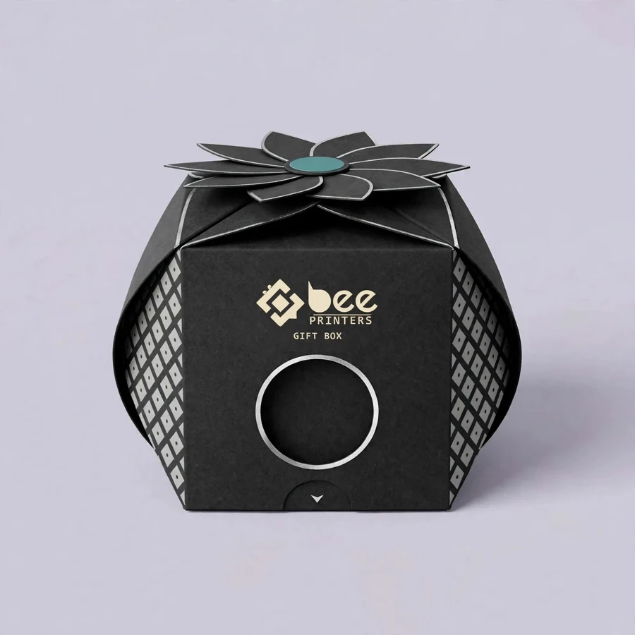
The inside of the box deserves the same attention as the outside. Because black kraft is dyed through, the interior carries the same deep tone, which looks clean and intentional without any extra work. A printed inner lid, a contrasting insert, or a simple tissue wrap can add a finishing touch for gift packaging, and the insert should be tested with the real product before the full run so the fit is right first time.
Retail shelves suit a compact tuck-end box that stands upright and shows the front panel to the customer. Gift sets suit a two-piece box with a lift-off lid, which adds a sense of occasion to the unboxing. Online orders suit a mailer-style box that survives the courier network and still looks good when the customer opens it at home. Choosing the style for the channel keeps the packaging practical instead of decorative.
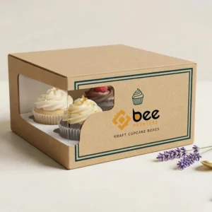
A window cut-out is another option worth considering. A small die-cut window lets the customer see the product without opening the box, which works well on a retail shelf where the product itself is part of the appeal. The window can be left open or covered with a clear film, depending on how much protection the contents need. Like any structural detail, a window should be planned into the artwork from the start rather than added as an afterthought.
Sizes are cut to order, from a small box for a single item to a large box for a set. Standard sizes keep costs down for common products, while custom sizes suit a brand with a distinctive product or a presentation idea that needs an exact fit. Measuring from the real product, including any insert or padding, is the step that makes the finished box close cleanly.
Brands usually order black kraft boxes in the hundreds or thousands, and wholesale quantities bring the per-box cost down. Larger runs spread the setup cost across more units, so the price per box falls as the quantity rises. Small runs are still possible for a new product launch or a limited edition, letting a brand test a design on the shelf before committing to a larger order. Boxes arrive flat-packed and ready to assemble, which keeps storage simple and shipping costs reasonable.
Planning an order starts with four decisions: the box style, the size, the board, and the artwork. Once those are settled, a sample can be produced so the brand can check the fit, the feel of the board, and the print quality before the full run. Sampling is worth the small delay it adds, because it is the last easy chance to change anything, and checking the sample in daylight and under store lighting is the surest way to confirm the black reads the way the brand expects. After approval, the full run is printed, cut, folded, and packed for delivery.
Brands that sell more than one product often order one design in several sizes, so the small pack, the standard pack, and the gift set all share the same artwork. This keeps the brand consistent and simplifies reordering, since the artwork file stays the same and only the dimensions change. Over time, a brand can build a small family of boxes that customers recognize at a glance.
For brands building out a full kraft packaging range, the custom kraft boxes collection brings together the box styles that suit this material, from plain kraft to black kraft, so a whole range can be planned in one place. And for a related look at printed kraft packaging, the five panel kraft boxes show how sturdy kraft board and clean printed branding work together. Both pages give a useful starting point for planning a black kraft box that fits the product, the brand, and the way it is sold.
| Material | Kraft, Cardboard, Corrugated, Rigid stock |
| Sizes | All custom sizes (any length × width × height) |
| Printing | CMYK / PMS, full-color, offset & digital |
| Finishing | Matte, Gloss, Soft-touch, Foil, Spot UV, Embossing |
| Add-ons | Window cut-outs, inserts, interior printing |
| Minimum Order | 100 boxes |
| Turnaround | 7 to 10 business days after design approval |
| Shipping | Free shipping across the US |